
 Posted by
 There is something I need to get off my chest.
As a concert photographer, I absolutely love great stage lighting. In fact, lighting is one of the things I pay close attention to whenever I walk into a venue. It can transform a performance, create emotion, add drama, and make an already great show visually spectacular.
But lately, I’ve noticed a lighting trend at some smaller venues that has become something of a personal nemesis.
Magenta.
More specifically, way too much magenta.
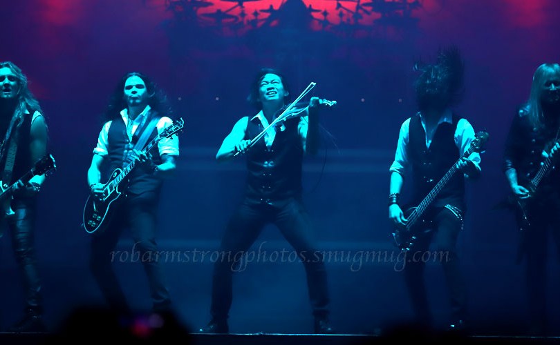
And when you combine it with an equally saturated cyan wash, my photographer’s blood pressure may actually go up a few points.
Now, before any lighting designer thinks I’m criticizing their craft, let me explain.
I have an appreciation for lighting that goes well beyond photography. I studied art, and my years working in entertainment gave me the opportunity to learn about stage lighting and production from professionals who actually toured with major artists. I’ve seen firsthand what thoughtful lighting design can do for a performance.
I’ve also been fortunate to learn from some pretty serious professionals along the way.
Donny Lodico is one of them.
Donny worked as an assistant to Howard Ungerleider, the longtime lighting designer and production figure associated with Rush, before going on to work as a lighting director for artists including the Goo Goo Dolls and George Strait. His work has also extended well beyond the concert stage, including serving as lighting director for Virgin Galactic and its promotional launch event.
That’s a pretty impressive résumé, but what I remember most is what professionals like Donny taught me: great lighting isn’t simply about putting more color on a stage. It’s about understanding the artist, the music, the venue, the audience, and knowing when to let the light enhance the moment rather than overpower it.
That’s probably why I’m a little more critical of lighting than the average concertgoer.
I’ve had the privilege of learning from people who do this at an entirely different level.
And I’ve learned that sometimes less really is more.
There’s Pink… And Then There’s MAGENTA
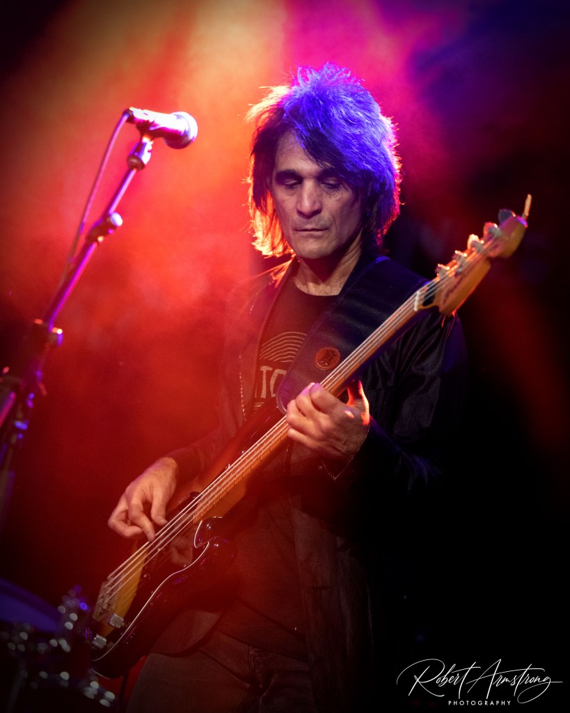
One thing I think gets lost in all of this is that there is a tremendous difference between a subtle pink or “no-color pink” wash and highly saturated magenta.
A properly balanced downstage wash can be incredibly flattering. It can add warmth and dimension to a performer’s face while allowing the audience—and the camera—to see natural skin tones.
That’s good lighting.
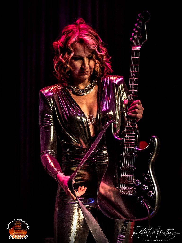
But turn that same color up until it resembles a neon sign and things change quickly.
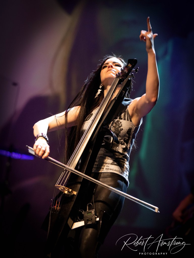
Suddenly, performers don’t look naturally lit. Their skin takes on an unnatural color, facial features become less defined, and from behind my camera, I’m thinking:
“Oh boy… here we go.”
And then, inevitably, comes the cyan.
The Magenta-Cyan Combination
I’ve seen several smaller stages embrace the combination of highly saturated magenta and cyan.
I understand why.
It looks bold. It looks modern. It can create that futuristic, almost cyberpunk atmosphere that has become popular in live entertainment.
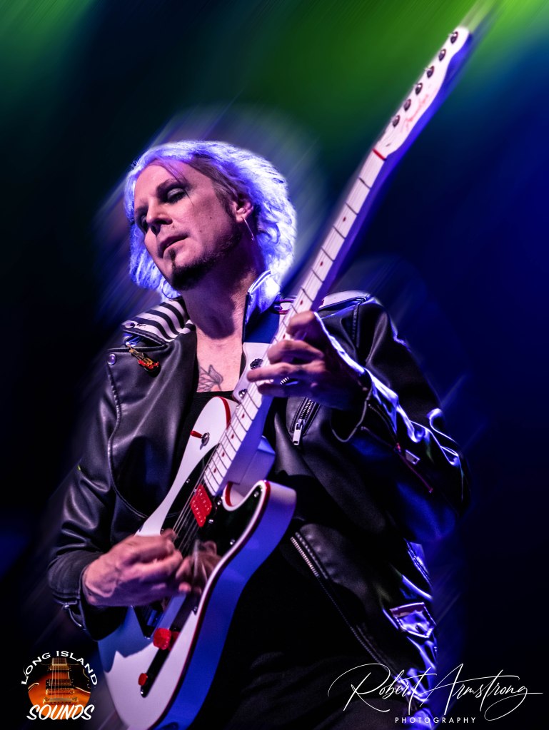
But when both colors are extremely saturated and continuously washing the performers, the result can become visually exhausting.
And for a photographer?
It’s a nightmare.
I’m not trying to photograph a lighting fixture.
I’m trying to photograph the musician standing underneath it.
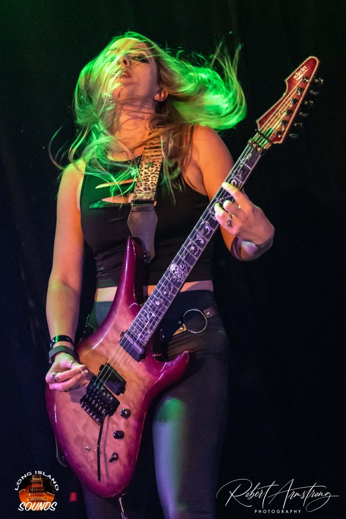
When the lighting is balanced, I can capture the expression on a singer’s face, the concentration of a guitarist, the sweat and energy of a drummer, or the interaction between musicians.
When the entire stage is drenched in intense magenta and cyan, those details can disappear beneath the color.
And while today’s cameras and editing software can perform some pretty impressive magic, there is a limit to what I can rescue afterward.
Sometimes, there simply isn’t enough natural color left to work with.
Give Me Some Contrast!
This is where I think great lighting design really shines.
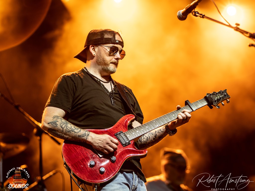
Give me a little color in the background and a clean wash on the performer.
Give me a warm light from one direction and a cooler color from another.
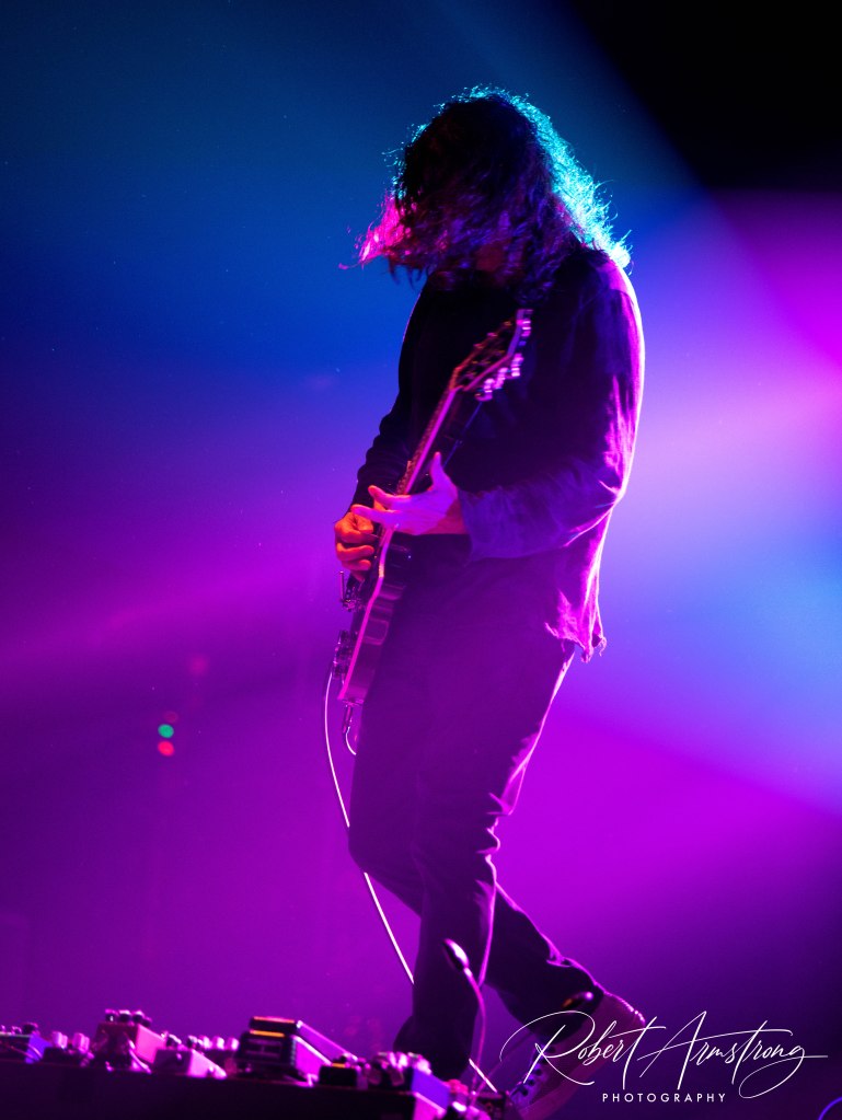
Give me a silhouette.
Give me backlighting through some haze.
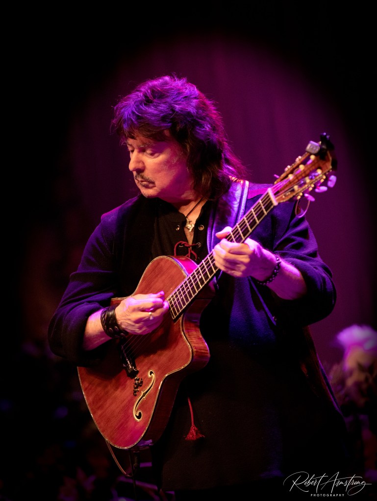
Give me a spotlight during a guitar solo.
Give me contrast!
The best lighting I’ve seen doesn’t necessarily use the most colors. It uses the right colors at the right time.
And that’s something the audience may never consciously notice.
They simply look at the stage and think, “Wow, that looks great.”
That’s the goal.
This Isn’t an Attack on Lighting Designers
I’ve worked with enough lighting professionals to know that creating a great live lighting show is an art form all by itself.
The lighting designer has a completely different job than I do.
They’re thinking about the entire room.
I’m thinking about a 16:9 frame.
They’re thinking about what thousands of people are seeing from the audience.
I’m thinking about what my camera is seeing from the pit or FOH.
And sometimes those two perspectives don’t completely agree.
That doesn’t make one of us right and the other wrong.
It simply means we’re looking at the same performance through different lenses.
Literally.
So, What’s My Solution?
I’m certainly not suggesting that venues eliminate color.
Please don’t.
A stage bathed entirely in white light isn’t particularly exciting either.
I love dramatic lighting. I love color. I love haze, beams, backlighting, silhouettes, and all the visual elements that make a concert photograph come alive.
I just think there’s a difference between using color to enhance a performer and using so much color that the performer gets lost inside it.
And if you’re going to use magenta?
Please…
Just give me a little white light with it.
My camera—and the artist’s face—will thank you.
Because ultimately, I’m not there to photograph the lights.
I’m there to photograph the people.
And when the lighting, the music, the performance, and the photography all come together, that’s when a concert becomes something worth remembering.


 Long Island Sounds